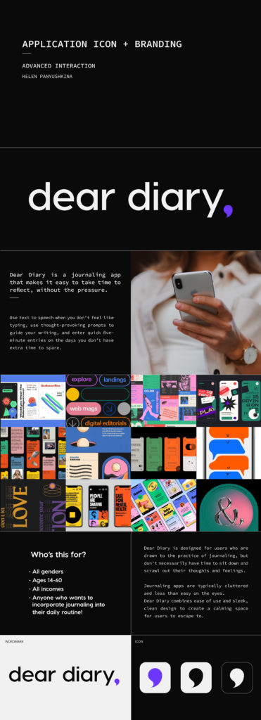
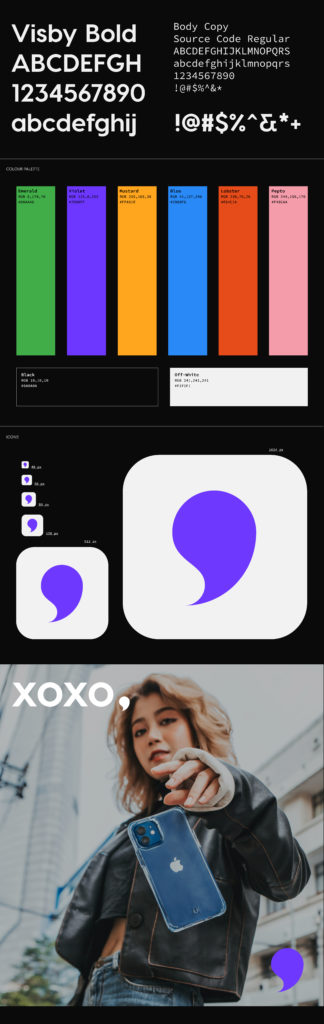
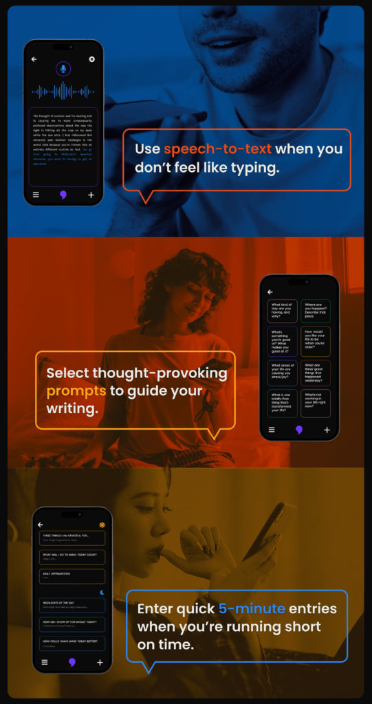
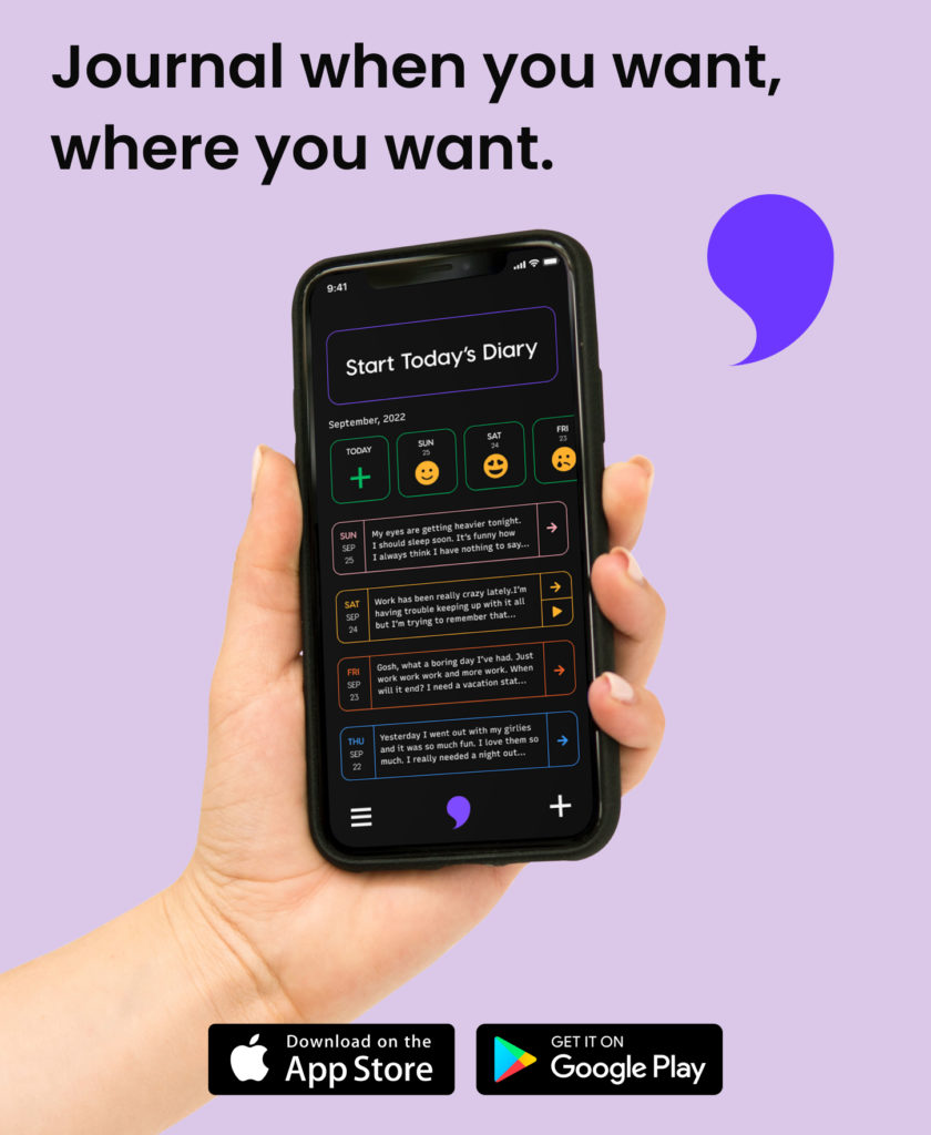
The logo for Dear Diary took shape as none other than a comma, the glyph that traditionally succeeds the titular phrase. The logo may also be interpreted as a speech bubble, a nod to the app’s speech-to-text feature. The final design for this application delivers a clean, sleek identity with vibrant pops of colour. Most journaling apps on the market are chaotic and cluttered, so so my goal was to provide the user with both a simple interface and stylish aesthetic.